Integrated Interface System for Industrial Mixing Appliance — 24-hour Design Challenge

Introduction
In the bustling world of industrial baking, where precision and efficiency are key ingredients, self-explanatory User Interface is a must. Tasked with enhancing the user experience of a company’s devices (let’s call it a Baking-Mixing Company for this purpose), I embarked on a journey to design a user-friendly interface for the customization and automation of the mixing process.
1. Discovery — Who is the user?
Where the World of Dough and Machines Mixes
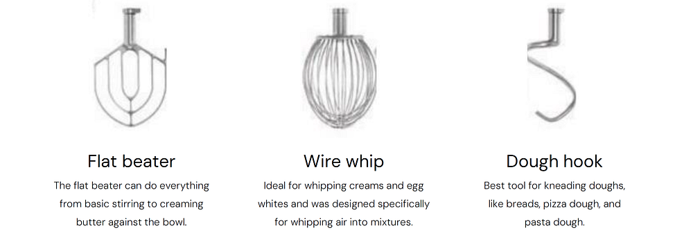
To truly understand the context, I dived into the industrial machinery and explored various head types used in the process of creating the perfect cookie dough. Additionally, I crafted an archetype of the typical user based on the available data and mapped out their user journey.
Industrial Mixing Appliance - Examples

Mixing Head Types
Research on Potential Users

User Journey

2. Ideation — What is possible?
Seeking Inspiration
In the ideation phase, I sought inspiration from innovative solutions across industries. Collecting photos showcasing unconventional design elements, I explored possibilities that could be integrated into the baking machine’s interface. The Crazy 8 task allowed for quick brainstorming, opening the bridge to creative ideas for the GUI and physical buttons.
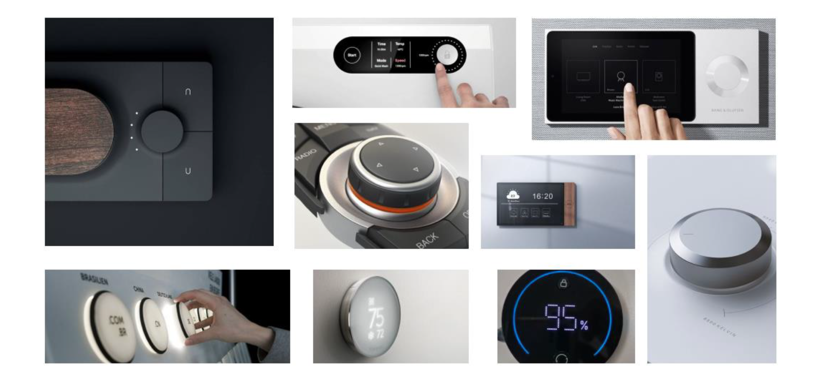
Crazy 8 — Ideation Method’s Results
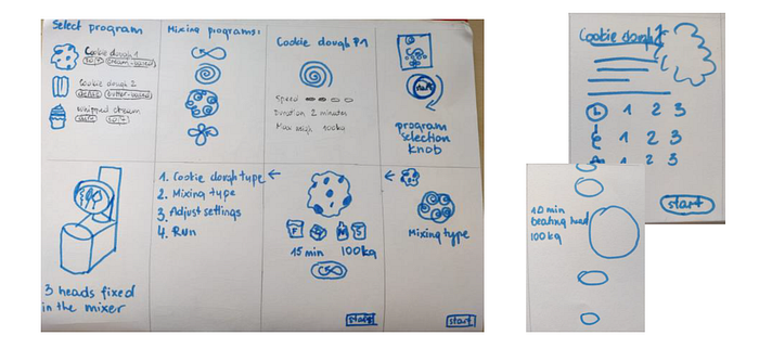
3. Design — What should it do?
Blueprints of Interface
Not fully convinced with any particular idea but trusting the process and hoping for a breakthrough, I transitioned into the design phase. Crafting wireframes and exploring multiple design variations, I envisioned a user interface that met the technical specifications and resonated with the user’s needs.
Wireframes

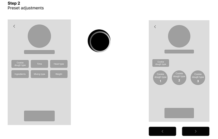
Low-fidelity Prototype
Bringing the design to life, I created a low-fidelity prototype using Figma. This interactive representation showcased how users could navigate the interface, preset mixing programs, and stay informed about the ongoing process.

4. Evaluation — Does it work?
Putting the Prototype to the Test
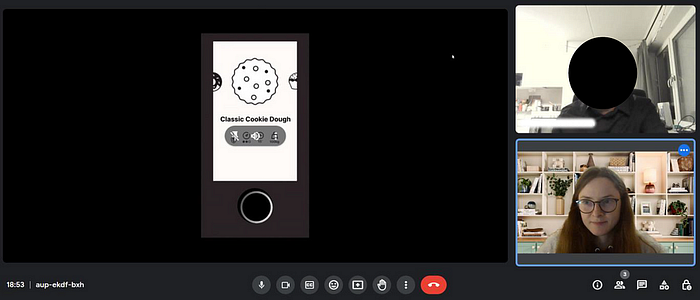
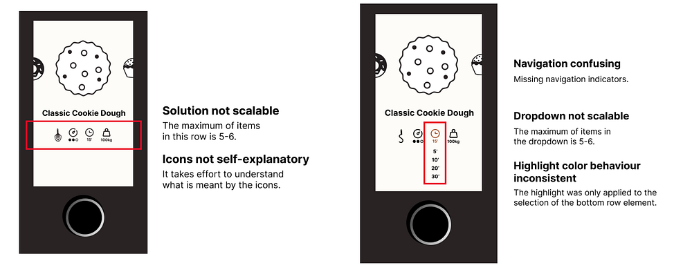
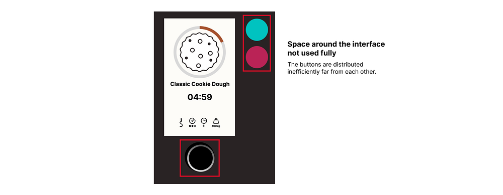
To ensure the usability and effectiveness of the initial concept, a usability test was conducted with one of my fellow designers. Observing a user interact with the prototype brought valuable insights and potential pain points. This crucial feedback laid the foundation for the next step — redesign.
Usability Test
Evaluation Results
5. Redesign — How to make it better?
Refining for a Polished (because I’m Polish) Finish (if only I lived in Finland this joke would be even more dad-like)
Taking the lessons learned from the evaluation phase, I refined the low-fidelity prototype into a high-fidelity masterpiece. The redesigned interface addressed usability concerns and brought an aesthetics touch to the GUI appearance.
Redesign Proposal


Hi-fidelity Prototype
Wrap Up
As we wrap up our 24-hours Design Challenge with the Baking-Mixing Company, the first batch of perfectly golden cookies is coming out of the oven. The interface is now ready to empower line managers in the hustle and bustle of industrial bakeries. It’s more than just buttons and screens; it’s a symphony of flour, innovation, and premium cookie production. Happy baking, happy designing, and here’s to many more batches of success in the UX kitchen!
