Case Study — Digital Journal App
Introduction
Hi, I’m Natalia, a Polish designer, currently undergoing a Master’s Degree in Human-Computer Interaction and Design at the Universidad Politécnica de Madrid, Spain. I enjoy designing things that have personality and balancing out an aesthetic appearance with functionality is my great passion.
Paraphrasing Blaise Pascal, I didn’t have time to write a short letter case study, so I wrote a long one instead, I think simplicity is quite hard to achieve. Yet unbundling complexity to self-explanatory components and uncovering the core of the issue gives me a lot of satisfaction, especially when the problem lies in a different place than we initially suspected.
This is my first Case Study and I’m happy to share the process and the outcomes of a 4-month long Human-Computer Interaction Project course with you, and I would also like to say thank you to my fun and supportive team, Patricia, Octavio and Andy!

Topic
The topic that we decided to cover this semester was Journaling and Mood Tracking. In brief, something that will let the users keep track of their memories and feelings associated with these memories. You may think it resembles some of the already existing apps like Instagram, but our idea aims at people who don’t feel comfortable oversharing on social media and would rather keep the memories only for themselves, but still having their thoughts and emotions organized in a timeline. The primary goal was to maintain privacy as a priority and sharing the posts only with the ones we want to.

Methods
In-person User Research | Contextual Inquiry | Observation | Profiles Creation | User Journey Map | Ideation | Lo-fi Prototyping | Navigation Map | Tasks creation| Usability Testing | Hi-fi Prototyping | Second Iteration of Usability Testing| User Satisfaction Questionnaire | User Experience Questionnaire | Interface Programming
Process Outline
- User Research
- Lo-fi Prototyping
- Usability Testing
- Hi-fi Prototyping
- Second Iteration of Usability Testing
- Conclusions and Next Steps

1. User Research
To get more perspective on the topic, we performed several interviews and observations that supplied us with valuable insights. Some of the findings helped us shape the process of creating a memory and we also defined two main profiles.
Preparation Of Templates
- Interview Questionnaire
- Observation Template


Interviews
Besides general demographics questions, we wanted to get to know users’ habits when it comes to saving their memories. That’s why we asked whether they keep a journal, track their moods, save images or post on social media.
Some relevant insights we got from 13 participants were that:
- Saving memories is usually an event-driven action — users don’t save memories regularly but rather log only highly important ones.
- Users use various methods to remember a memory depending on the event type. Sometimes it’s a picture, sometimes video, text or an audio recording.
- It’s hard for users to maintain a structure of memory since each event is a unique experience. Moreover, consistency is also troublesome.
- Users value their privacy and don’t share every important memory on social media.

Contextual Inquiry
To get an overall idea of how the users save memories we asked 9 of them to perform a couple of tasks including:
Recall and save a recent positive memory on social media.
Recall your last trip and make a digital or physical memory out of it.
What we observed was that most of the users relied on their mobile phones, although some would prefer to use physical assets claiming it’s more meaningful to them. The participants used various elements to create a memory — location, tags, description, although they don’t like to be forced to use a rigid structure and fill all the fields. They want to have freedom when composing.
What got our interest was also that the participants used their gallery to find inspiration for the post and often felt nostalgic coming across an old photo. Additionally, a part of the participants suffers from a mental health problem and tends to use journaling as a tool to monitor the mood swings.

Profile
We noticed that although users tend to save memories in a form of journals or on social media, they have different motives for doing that.
One group feels the internal satisfaction when laying their thoughts down, they want to have a stamp of the time saved in some form, for instance on paper, in a notepad or with an audio recording and their goal is not to share these creations with the world, but rather a sentimental outcome. The memory-saving frequency varies mostly on the intensity of events happening and focuses on life highlights.
On the contrary, the second group doesn’t mind sharing their memories publicly. They often find it as an alternative way of contacting people and also valuing the aesthetic visual appearance of their posts and structure. Therefore the two key profiles we defined were an Introvert and an Extrovert.
From the psychological perspective, that’s obviously oversimplified since both the groups may behave contradictory with the premise, but acknowledging these differences helped us empathise with the user.


Task Organization Model


Tasks
Based on the insights from the interviews and observations we decided to design and test 3 tasks.
- Register the mood
- Log the memory
- Explore the mood patterns
User Journey Map
This UJM shows the process of logging memory and trying to remember it afterwards.


2. Lo-fi Prototyping
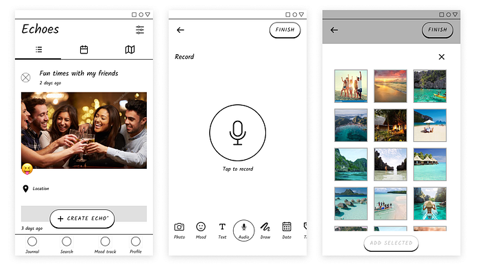
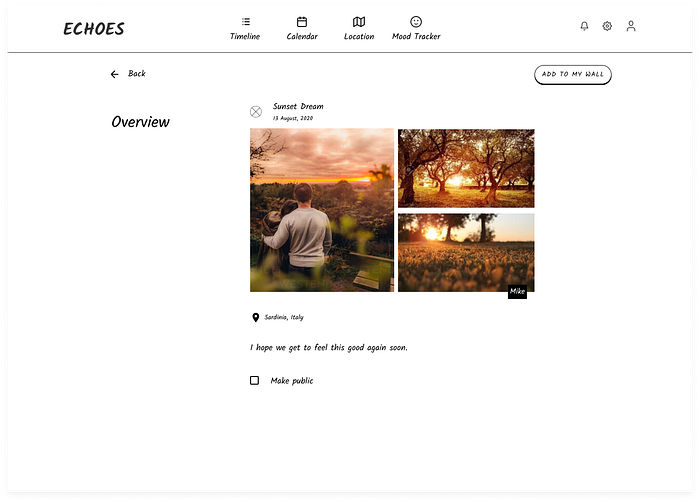
Even though we found out already in the interviews that the majority of users prefer to use a mobile phone to save memories, we didn’t want to limit ourselves to only one design. Hence, two separate designs were created, the first one for a mobile phone, the other one for a desktop.


Key Differences
Also, the designs contained different solutions for the same issues that aimed to test which option has more supporters. For instance, the mood selection was designed to rotate a circle in the mobile version and to select a mood from tiles on the desktop.

Moreover, the customization panel was a scrollable bar in mobile and a panel with all the options visible at a glance in the desktop version.


3. Usability Testing
The usability testing was performed using the “thinking-aloud” technique with users of 4 nationalities, and during the test, we measured effectiveness, efficiency and user satisfaction through questionnaires we had prepared beforehand. In total, there were 12 participants performing 3 tasks in Useberry.
Half of them (3 Extroverts and 3 Introverts) started with the mobile prototype and then continued with the desktop prototype while the other half (also 3 Extroverts and 3 Introverts) started from the second prototype.
Mobile Device Prototype
One of the tasks — Log an event can be seen in a recording here:
Desktop Prototype
And the same task performed on the desktop app can be seen here:

Tools

Process
- Welcome text.
- Gathering personal information.
- Usability testing of one of the prototypes. Gathering data and noting down observations.
- User satisfaction questionnaire and general impressions.
- 🔄 Repeat step 3 and 4 for the other prototype.

Effectiveness — Mobile Prototype

In this table, we can see how all tested users were able to complete every task and committed around 1.583 mistakes (considering all tasks) on average on this prototype. At the same time, the standard deviation tells us that the number of mistakes varied among the participants. We can have visual sight of this in the following bar chart:
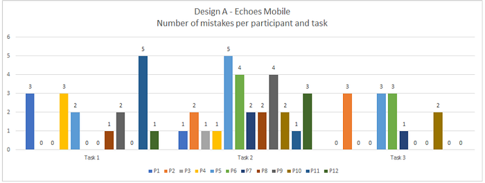
The bar chart shows that mistakes didn’t vary exaggeratedly, with many users making 0 mistakes and other users making more mistakes than average. It is also worth mentioning that 7 out of 12 users committed no mistakes in the last task and that 5 out of 12 users committed no mistakes in the first task.
Effectiveness — Desktop Prototype

In this table, we can see how all tested users were able to complete the tasks and committed around 2.917 mistakes (considering all tasks) on average on this prototype; the most mistakes were committed in the second task. At the same time, the standard deviation tells us that the number of mistakes varied considerably among the participants, especially in the third task.

The bar chart shows that there were a lot of mistakes in task 2 and the number of mistakes per participant varied a lot in task 3. In task 2 only 2 out of 12 participants committed 0 mistakes, and the same users that made the most mistakes in task 2 (participants 5, 6 and 10) also made the most mistakes in task 3 by a large margin.

This box and whiskers diagram shows in a visual way that the first design is better in terms of mistakes committed and general effectiveness.
All things considered, we think the first design, Echoes Mobile, is better from the viewpoint of effectiveness since all values are considerably better and lower standard deviations combined with fewer mistakes means it’s likely that the same errors are being found and thus it’s less costly to be corrected.

Efficiency — Mobile Prototype

In this table we can see how tested users on average took 1 or more extra actions than needed; the standard deviation values tell us that the numbers of actions didn’t vary a lot, and the relatively low ratios tell us that users were close to the optimum number of actions. We can have visual sight of these insights in the following bar chart:
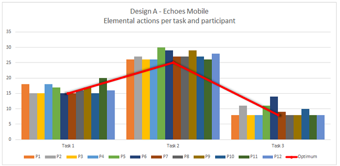
The bar chart shows that actions didn’t vary considerably, with a few standard exceptions. We can also see that task 2 had the highest number of extra actions overall between participants since almost all of them are above the optimum.
Efficiency — Desktop Prototype

In this table we can see how tested users on average took more extra actions than needed, especially for tasks 2 and 3; the standard deviation values tell us that the numbers of actions varied a lot, and the low ratios tell us that users were close to the optimum number of actions. We can have visual sight of these insights in the following bar chart:

The bar chart shows that the numbers of actions in tasks 2 and 3 varied considerably: in task 2 this variance was caused by all participants, while in task 3 the high standard deviation was mostly caused by three participants.

This box and whiskers diagram shows that the first design is better in terms of ratios of actions and general efficiency.
Overall, Echoes Mobile is better from the viewpoint of efficiency since all values are considerably better and lower standard deviations translate into the number of elemental actions being more consistent and thus fewer chances for both mistakes happening and users going outside of the optimal flow.

User satisfaction: SUS Questionnaire
Average SUS score: 80.63
SUS score’s standard deviation: 17.71


SUS For Second Design: Echoes Desktop
Average SUS score: 79.79
SUS score’s standard deviation: 12.90

Analysis Of User Satisfaction (SUS Questionnaire)

According to the SUS score obtained for each of the prototypes, we can see that even if there is not a big difference in the values the “winner” of the overall SUS questionnaire is the Mobile prototype. This means that, even if both prototypes have high scores, the Mobile prototype is preferred among the participants.

Findings
Some of the main usability problems we have found are the following:
- The overall experience felt limiting due to constraints related to the lo-fi prototype. The prototype had a rigid order of performing a task while users wanted to swap some of the bullets. However, that was partially a success because the mental model aligned with the one we expected.
- Some participants complained about not getting enough feedback due to the low level of details for both prototypes.
- One of the sections of the app — The Mood Tracker was hard to discover in the mobile prototype, mainly due to the mere selection of the icons.
Conclusions were simple, the users prefer the mobile version for its similarity to apps they already know, that they can quickly switch between memory customization modules and for the clean design with visible CTAs.

4. Hi-fi Prototyping
After carefully selecting colours, fonts and components to match the look and feel we associated with Echoes, there came the time for the UI design.

Navigation Map


Main Improvements — Information Reduction
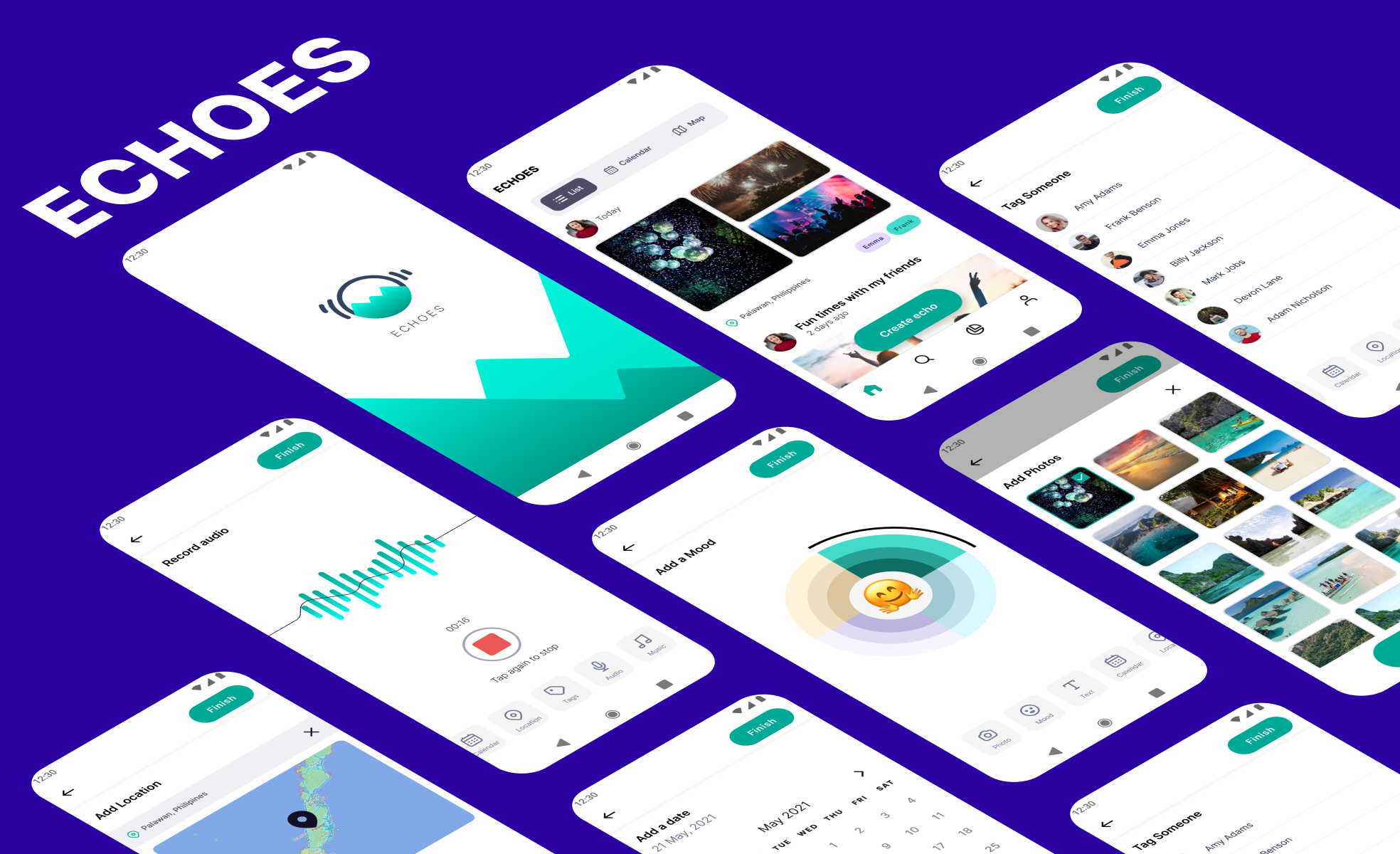
Some of the users complained that there were too many options to choose from on the home screen and therefore, they struggled to complete the task. We added labels to the top navigation bar and made it more prominent and also adding respective icons to the bottom navigation bar.

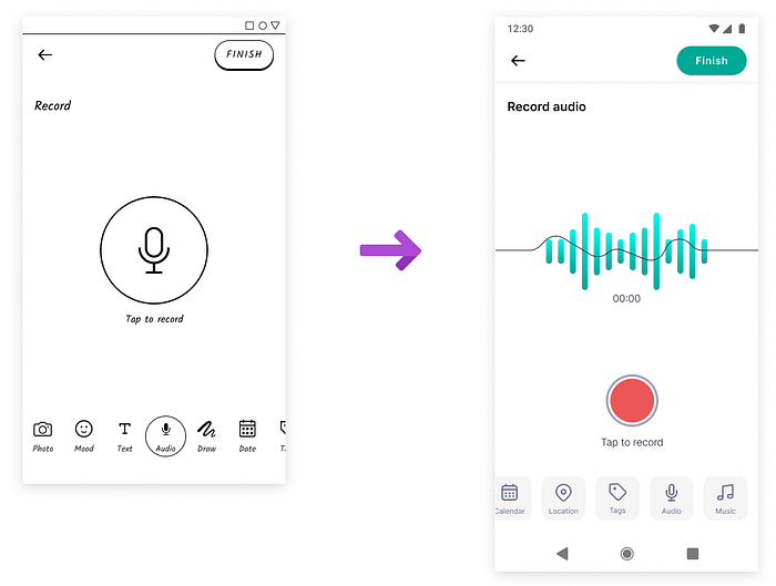
Main Improvements — Audio Recording
Users had troubles audio recording themselves since they didn’t know how the button works. We solved it by adding a “Tap to record” label. The position of the button was also moved lower for a better thumb reach.

Logo

The logo represents mountains where the Echoes are resonating. The aim was to picture the peace of mind and encapsulate Echoes in an illustration.
The name we came up with — Echoes — relates to the memories that are echoing inside of our heads waiting for a moment of nostalgia that will bring them back to life.
Echoes are a quick way to capture moments, specify moods, add companions and places — everything that constitutes the memory. Some of this data will be later used to recognize mood patterns and help to build better habits by creating awareness of the impact of the specific event on the user.

5. Second Iteration of Usability Testing
In the second iteration, we were testing only one of two designs — the mobile one that we have programmed in Android Studio. The prototype in a form of an apk could be installed by the users on their phones increasing convenience and real conditions. In several sessions, we performed 12 usability testings where 6 out of 12 were entirely remote. This was not the easiest thing to adjust the testing to the online scenario but with a help of various tools, in my case, it was Google Meet and screen recording, we were able to both observe the participant and the screen that he or she is operating with.
Effectiveness
Comparing the hi-fi and lo-fi values, it looks like the lo-fi prototype “wins”. The possible reason for that would be that in the lo-fi testing sessions users didn’t have direct control over the prototype because there was only one possible order of performing the tasks. In the hi-fi prototype, they had the freedom to take a look at functions that are not needed to complete a task and often didn’t pay attention to the time taken. In other words, they had a correct mental model build on how to use the creation functions so we take it as a success!


Efficiency
When comparing the hi-fi and lo-fi efficiency ratios, the lo-fi prototype scored better at efficiency similarly as at effectiveness. We think it’s again the case of flexibility on the order of performing tasks which may have lead to taking risks by clicking more just to make sure if they were attempting the task correctly.


User Satisfaction — SUS Questionnaire
As it can be seen in the values in the table below, the hi-fi prototype scored better after the performed tests than the previous lo-fi prototype. Furthermore, thanks to the standard deviation values we can observe that participants showed a higher level of agreements on the questionnaire this time. Overall, we could say that participants liked our improved hi-fi prototype after we implemented improvements based on the first iteration’s results.


User Experience — UEQ Questionnaire
We analysed the prototype in a context of six categories as can be seen below and overall 4 out of 6 scores were excellent and 2 out of 6 were good.

Analysing each of the categories we can say that:
Attractiveness: Our participants really liked our application overall, emphasizing the look and feel of the flow and the essential visual design.
Perspicuity: Our participants found our design to be simple and quite easy to learn, especially thanks to simple and familiar UI items.
Efficiency: Our participants praised the design as being fast and straightforward.
Dependability: Our participants thought the design was predictable and pleasant, although a few imperfections here and there resulted in a slightly lower score.
Stimulation: Our participants didn’t feel like the app is extremely fun or entertaining to use, although it’s understandable since the app is meant to trigger emotions and nostalgia.
Novelty: Our participants are aware of the fact that many other mood tracking and memories-saving apps exist in the marketplace already, but we’re happy they still appreciated our competitive advantage.

General Impressions
🟦 What users liked.
🟨 What users didn’t like.


Main Usability Problems


6. Conclusions and Next Steps
It was a fascinating project and really nice teamwork with Patricia, Andy and Octavio. There are still some things that we could do to improve the current product:
- More testing iterations —the sessions were key to see issues that could make the experience more delightful for users, and it helped us pinpoint details that we overlooked.
- Implement design improvements — the prototype had several negative issues that we identified and found solutions for. We believe that once these problems are solved, the prototype will perform even better.
Final UI Design


Thank you!
Find me on LinkedIn: https://www.linkedin.com/in/nswierz/
or Dribbble: https://dribbble.com/nswierz
